The Weeknd is no stranger to reinvention. His reign as one of the top musicians and entertainers of our time has been so wondrously crafted into different eras that reflect the times of his life. The rollout for all of Abel’s albums have been so carefully created – everything from his photography style, design aesthetic, colors, typography, and cultural references revolve around a new character persona for each body of work. From the early days of a drug-infused Toronto underground, to the spotlight in glitzy Los Angeles – immerse yourself in The Weeknd’s eras through the years.
The Trilogy Mixtapes Era [2011]
The year is 2011, the second decade of the century just kicked off and music is finding itself within a radio-pop sensationalized lull. Enter Mr. Abel Tesfaye under the alias ‘The Weeknd’. Honed by the singles Wicked Games and High For This, Abel ushers in an entirely new era of music when he drops his first of three mixtapes, House of Balloons. What follows is a year of reinvention for the R&B genre in the form of two more eclectic, dark, sex and drug-induced mixtapes, Thursday and Echoes of Silence.
Abel describes his trilogy mixtapes as a claustrophobic body of work inspired by his limited world view growing up within the borders of Scarborough and Toronto his whole life. For 21 years, he’d never been on a plane, spending his life within one setting. He explains ”I spent my entire life in one setting, that’s probably why pieces of the album feel like one long track, because that’s what my life felt like. It felt like one long song.”
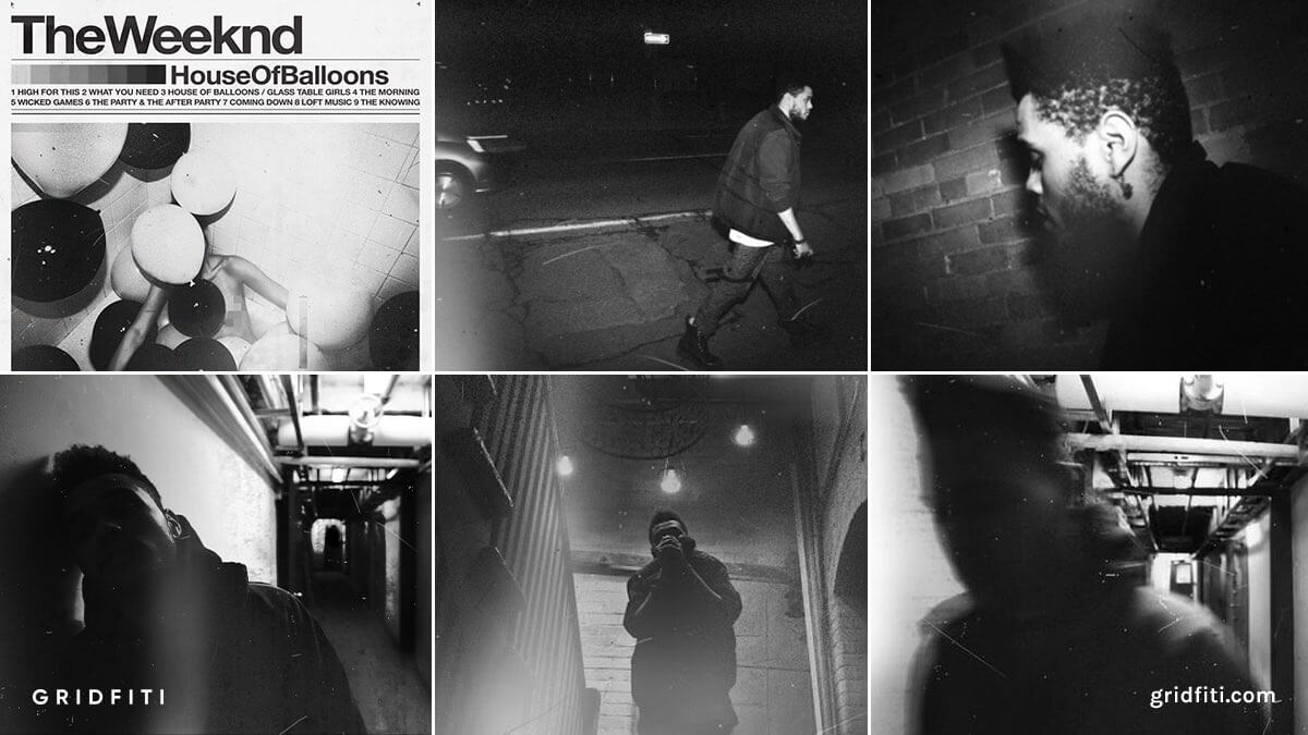
Besides being a huge launch for Abel’s career, it’d also serve to launch the careers of his frequent collaborators. His right hand man, creative director and fellow high school dropout La Mar Taylor would go on to help produce all of his projects inside the studio and out. Vancouver-based graphic designer Ben Wantek would become a frequent design force in Abel’s future works after bringing the cool print-demo aesthetic we see in the Trilogy mixtapes using Helvetica Bold, expired film and Polaroid-like photos, color bars, trim, marks, and more.
House of Balloons [Spring 2011]
Thursday [Fall 2011]
![Thursday The Weeknd [Fall 2011]](https://gridfiti.com/wp-content/uploads/2022/01/Gridfiti_Blog_WeekndEras_Trilogy_Thursday.jpg)
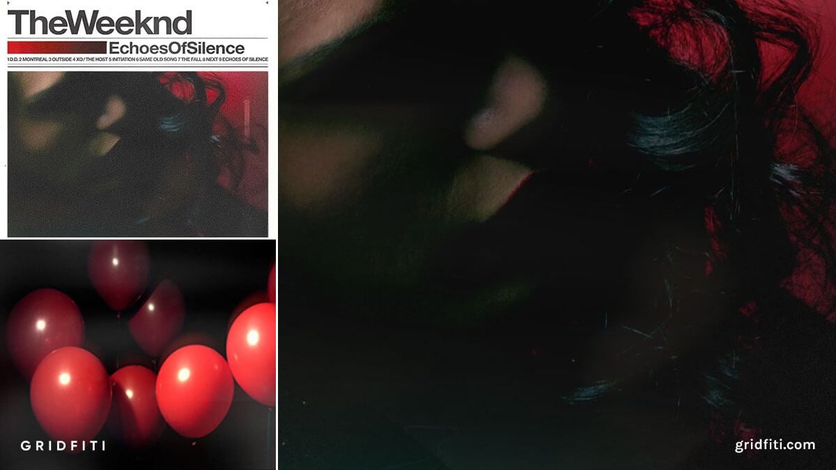
Echoes of Silence [Winter 2011]
Kiss Land Era [2013]
In September 2013, Abel brought us his first ever studio album. Looking like it came straight out of a Ridley Scott-directed, Takashi Murakami-infused futuristic Tokyo, Kiss Land introduces us to the mind of The Weeknd in what he calls the second chapter of his life.
Kiss Land’s aesthetic takes cues from Japanese anime lore, due to the fact that Japan was the furthest Abel had ever been from home – feeling like a different distant planet.
Kiss Land acted as a backdrop for Abel’s first go at tour life. Just like his trilogy mixtapes symbolized his limited reach within Toronto, Kiss Land is a world he says he created in his head – a world made of terror and unfamiliarity. The production, background screams, and eeriness reflect the fear that he was feeling experiencing many things for the first time.
With prominent hits of black, neon green, yellow, magenta, and using neon-inspired typefaces like Anders, Ben Swantek and another one of Abel’s frequent creative collaborators, Drop, worked to create a world inspired by thriller and sci-fi directors Ridley Scott, John Carpenter, and David Cronenberg. Abel’s team looked to these directors on how to convey fear and uneasiness in the best way possible. Think Blade Runner meets Tokyo, meets the mind of Abel – and what do you get? Kiss Land, an album with incredible visual styling.
![The Weeknd Kiss Land Era [2013]](https://gridfiti.com/wp-content/uploads/2022/01/Gridfiti_Blog_WeekndEras_KissLand.jpg)
Beauty Behind the Madness Era [2015]
Rocking stills taken on 35mm film and a Mars Attacks! like font, collage artist Kalen Hollomon describes the artwork he made for The Weeknd’s sophomore album Beauty Behind the Madness as taking inspo from vintage Italian horror films. Except the narrative behind BBTM was grounded in its location, Los Angeles, and the experiences that came with the city.
Abel forayed into a more mainstream sound while still honing his distinctive qualities. He reached entirely new audiences (with features from artists like Ed Sheeran and Lana Del Ray) in this era while still being very intimate with his core audience from the Trilogy days.
Where Kiss Land took visual inspiration from the great sci-fi directors of the 80s, BBTM would allude to more horror and psychological thriller films of the 90s and 2000s. The creative direction of the project used minimal colors like black and yellow, taking inspiration from films such as Eyes Wide Shut, 8mm, and Jacob’s Ladder.
![Beauty Behind the Madness The Weeknd Era [2015]](https://gridfiti.com/wp-content/uploads/2022/01/Gridfiti_Blog_WeekndEras_BBTM.jpg)
Starboy Era [2016]
It’s the fall of 2016 and unbeknownst to us, the King of the Fall is about to crash the music scene with his vibrant, potent, braggadocio third album, Starboy. Homeless to Forbes List and rocking a new haircut and aesthetic, Abel employs frequent collaborator Ben Swantek again, with photographer Nabil Elderkin taking on the task of capturing this new era of The Weeknd – with primary hues red, yellow and blue, and the bold, unmistakable Frisans Pro typeface.
The Starboy name refers to Abel’s step into his rockstar mantle, straying far from his underground roots before hitting the world stage. The name refers to his newfound celebrity profile, exploding into fame and not knowing how to handle the trials it comes with. The name was also inspired by David Bowie’s 1972 ‘Starman’, whose themes revolved around confronting fame as well.
The album features artists from Kendrick Lamar to Lana Del Ray, with Daft Punk supporting as the most unique addition to the record on the titular Starboy track. Abel released a 12-minute short video encapsulating a few of the singles. This short is where the cinephile side of The Weeknd comes out, with lots of visual references to Nicolas Winding Refn’s Drive and more notably, The Neon Demon which would make a larger impression on the look and feel of the visuals.
Everything about this project, from the rollout of singles, to the imagery and videos, is once again, synonymous with a new step in Abel’s evolution – going from a Toronto kid who’s never seen the world and felt nervous on tours, to owning his fame and dealing with the repercussions that come with it.
![The Weeknd Starboy Era [2016]](https://gridfiti.com/wp-content/uploads/2022/01/Gridfiti_Blog_WeekndEras_Starboy.jpg)
My Dear Melancholy Era [2018]
Situated at a midpoint between the pop fame high of Starboy, and Abel’s next project, comes The Weeknd’s first EP, My Dear Melancholy.
Where Beauty Behind the Madness and Starboy featured more mainstream sounds, My Dear Melancholy saw a return to Abel’s earlier darker side of music. Understandably so as the EP was lyrically built around heartbreak, mainly inspired by his past relationships with model Bella Hadid and singer Selena Gomez.
A relatively short body of work designed, once again, by Swantek around themes of darkness and despair – with its cover featuring a grainy close-up image in a monotone orange and black, and Engravers Bold typeface – My Dear Melancholy served as a return to older Weeknd. Little did we know what was next.
![The Weeknd My Dear Melancholy Era [2018]](https://gridfiti.com/wp-content/uploads/2022/01/Gridfiti_Blog_WeekndEras_MDM.jpg)
After Hours Era [2020]
Where do we even begin with After Hours? The culmination of a year’s worth of narrative-building, some of the most stunning cinema motifs, method acting in public, and so much more. We’ve seen all of the great work, eras, and aesthetics from the Trilogy era to Starboy, but nothing would prepare us for what was to come in 2020 with After Hours.
The album served as yet another reinvention for Abel, with the title being taken from the 1985 film of the same name by Martin Scorsese. The Tammi brothers handled the album’s artwork direction, with Aleksi Tammi leading the design and Anton Tammi directing the project’s stunning music videos. La Mar Taylor was always there by Abel’s side to lead the creative direction with Nabil Elderkin making a return to capture the photography once again.
The color palettes throughout the project are made up of hues of red, gold, and cooler blues and greens – most notably with Abel’s red suit contrasting against the flashy golden lights of Vegas, and the gleaming blue city lights of LA. The primary typeface used in this era is custom and dubbed ‘Abel Roman’, inspired by The Exorcist film posters of the 80s, and emitting a similar eeriness in the album artwork and tour posters.
We could go on for days about the cinematic inspiration within the the videos. Bits and pieces of movie scenes can be seen throughout, taking inspiration from directors like David Lynch, Martin Scorsese, Ridley Scott, and more. A careless dance in a tunnel similar to that of Todd Phillips’ Joker, a dizzy faze looking up at flashing Vegas lights similar to Scorsese’s Casino, over-the-top prosthetics to illustrate some major plastic surgery – similar to Tim Burton’s Joker. The cinephile side of Abel and his collaborators offer a myriad of visual treats in After Hours’ music videos.
Throughout the year of its release, Abel would seemingly method act his red suit-wearing character in the public – presenting himself this way at award shows with his new clean shaven face and fresh haircut. He’d adjust the look of his character in real life to match the events of his videos – from broken nose bandages, to plastic surgery, and more.
We’d see it all come to a ceremonious conclusion at Super Bowl LV with Abel’s halftime show. Abel painstakingly commits himself to this motif: an entire year of personifying this character to tell his story of the pain he felt after heartbreak – or how if you’re not careful, you become the one thing you loathe. In the case of the After Hours era, it’s to become the product of a vanity-loving Hollywood.
After Hours stands as Abel’s magnum opus. Never have we seen him devote himself to such an ideal. All of The Weeknd’s past eras have been leading up to such a monumental body of work.
![The Weeknd After Hours Era [2020]](https://gridfiti.com/wp-content/uploads/2022/01/Gridfiti_Blog_WeekndEras_AfterHours.jpg)
Dawn FM Era [2022]
Now, we’ve landed in 2022. Abel is back to his cryptic messaging and is ramping up for a whole new era: Dawn FM. The leading single of this new era, Take My Breath, has heavy synthwave and disco influences – like the brainchild of a Michael Jackson x Daft Punk track we’ve never heard. The video gives us hints of a cyberpunk, Tron-like future, with Abel himself looking like Wesley Snipes in Blade. The single’s artwork sports an 80s-inspired, intergalactic theme, hinting at some influences on the way for this next era.
The Weeknd’s next album, Dawn FM, drops January 7th. With appearances from 80s production king Quincy Jones, and eerie Jim Carrey voiceovers, to themes of ageing, retrowave aesthetics, and more – we can’t wait to see what he has in store for this next era. All we can say is, the dawn is coming!
![The Weeknd Dawn FM Era [2022]](https://gridfiti.com/wp-content/uploads/2022/01/Gridfiti_Blog_WeekndEras_DawnFM.jpg)
Which one of The Weeknd’s eras is your favorite? Are there influences we missed for any of these iconic periods? Let us know in the comments below, and make sure to follow us on IG @gridfiti.
Gridfiti is supported by its audience – when you buy something using the retail links in our posts, we may earn a small commission at no additional cost to you. We only recommend products we would use ourselves and recommend to our friends and family. Read more about our affiliate disclaimer.